

![[DIGITALE BIBLIOTHEK DER FES]](/images/digbib/d_digbib.gif)

SECTION of DOCUMENT:
[page-number of print ed.: 23 = blank page]
[page-number of print ed.: 24]
The Facts about Mobility
Peter Gottshalk
I will focus on mobility, in particular, on the difference between mobility and income inequality, the pros and cons of mobility and the amount of mobility in the United States today.
Why do we like mobility? Popular perception says that is good and that we should want more of it, or countries that have more of it are better off than other countries. There is a debate about how much mobility exists in the United States, how it compares to other countries and how mobility has changed in the recent past. The key question is whether or not mobility has increased. This contribution will seek to explain why this question is an important one.
The first issue is how to define mobility. When people discuss a rising or growing economy, they are talking about a rising mean and the fact that everybody is moving up. The popular press uses the term mobility in a very loose way; if everybody is gaining, they say that is upward mobility. But that is not mobility, that is economic growth. Much can be said about economic growth when looking at the mean, but the mean doesn't tell the whole story. After all, it may actually be that people already at the top are simply rising faster and faster, as they are today, while the people who find themselves at the bottom are sinking lower and lower in each successive year.
This brings us to the issue of inequality. When discussing the issue of inequality, however, one has to be very careful. Data showing the declining income of people in the lower brackets does not necessarily say that the people on the bottom are the same people in each successive year. Although the phrase "the rich are getting richer and the poor are getting
[page-number of print ed.: 25]
poorer" is commonly used, this is not exactly right. Those people who are rich at this time are richer than the people who were rich in the last period and the people who were poor in this period are poorer than the people who were poor in the previous period. That is what the numbers show.
This leaves open the issue of how much change or churning occurs, i.e. how many people move from level to level. That is what is meant by mobility. Mobility is defined as changes in relative positions. Mobility looks, for instance, at the question of whether people who are rich in one period become poor in the next period. Most important, however, is the issue of long-term mobility. While somebody who is poor in one year might not be poor in the next year, long-term mobility looks at his or her situation over a longer period. It takes the people who are poor in one year and looks at whether those same people are poor ten years later.
Why does the presence or lack of mobility interest people? There are three main reasons why it should. The first is basic ethics. One should hope to be born into a society where one's income is not predetermined by his or her parents' income. Likewise, if one ends up drawing the short straw at the beginning of life, this shouldn't determine one's lot forever. This is a basic ethical belief, but it also raises the issue of incentives. If one lives in a society in which lots are drawn at the beginning, there is no need to work hard. After all, those born with a golden spoon in their mouths will remain rich, regardless of whether or not they work hard. Those born in a stable will live in a stable throughout their lives. These incentives make a difference in any economy.
Finally, when looking at inequality, greater mobility causes a decline in long term inequality because high income in one year is canceled by low income in another year. Long-term income inequality becomes narrower in high mobility areas. After all, when the rich frequently become poor and the poor frequently rich, over a long period they grow closer
[page-number of print ed.: 26]
together. Mobility in fact links back to literature on inequality because there is an important connection between the amount of mobility and long-term inequality.
Table 1, taken from the Panel Study of Income Dynamics, shows short-term relative mobility with respect to family income. It is the standard data used in this field. This table shows that if you were in the lowest quintile in the first period, in 1990, there was a 75% chance that you would be in the lowest quintile in the next period. Although there is some movement, proving it is not true that everyone is stuck, the vast majority of the people who moved only made it to the second quintile. In other words, only 19% of those in the 1st quintile made it to the 2nd, with a smattering going higher. This means that 95% of the people who are "poor," or in the lowest two quintiles, remained there.
Now, when looking at the people at the top, one sees that close to 80% of those at the top were there in the next year. Again, there was minimal downward mobility.
|
Table 1 SHORT-TERM RELATIVE MOBILITY: ONE-YEAR TRANSITION PROBABILITIES BETWEEN 1990 AND 1991 (%) | ||||||
|
1990 Quintiles |
1991 Quintiles | |||||
|
1st Quintile |
2nd Quintile |
3rd Quintile |
4th Quintile |
5th Quintile |
Total |
|
|
1st Quintile |
75.1 |
19.5 |
3.3 |
1.4 |
0.7 |
100.0 |
|
2nd Quintile |
18.0 |
57.0 |
20.5 |
3.3 |
1.2 |
100.0 |
|
3rd Quintile |
4.0 |
17.0 |
57.9 |
19.1 |
1.9 |
100.0 |
|
4th Quintile |
1.9 |
5.2 |
15.6 |
60.4 |
17.0 |
100.0 |
|
5th Quintile |
1.0 |
1.4 |
2.9 |
15.6 |
79.2 |
100.0 |
|
Total |
100.0 |
100.0 |
100.0 |
100.0 |
100.0 |
100.0 |
|
Note: All tables are based on weighted data; totals may not add to 100.0 because of rounding; unweighted n = 12.242. Source: For all tables, computations by authors from Panel Study of Income Dynamics micro-data. Data are used through 1991, the most recent year for which data were available when the authors began their empirical work. | ||||||
[page-number of print ed.: 27]
Of course, it is easy to be mislead by the fact that numbers in the 1st and 5th quintiles are bigger than the ones in the middle. This can be explained, however, by the fact that, at either corner, there is only one direction to go. In the middle one can go either up or down, while at the bottom or top there is only one direction in which to move.
Table 1 shows one-year mobility and therefore, reflects transitory fluctuations. For example, some of the people in the middle quintiles might be in sales, where earnings often fluctuate from year to year.
In order to eliminate transitory fluctuations, Table 2 shows that long term mobility based on average income in 1968, 1969 and 1970, and an average income two decades later.
The numbers in Table 2 are striking. Over 50% of the people in the lowest quintile remain in the same quintile over a substantial period of time. Likewise, a large proportion of people at the top remains there. About 50% of the people who are either at the top or bottom tend to stay there.
[page-number of print ed.: 28]
Table 2 LONG-TERM RELATIVE MOBILITY: TRANSITION PROBABILITIES BETWEEN 1968 AND 1991 BASED ON THREE-YEAR AVERAGE INCOME (%) | ||||||
1968-70 Quintiles |
1989-91 Quintiles | |||||
1st Quintile |
2nd Quintile |
3rd Quintile |
4th Quintile |
5th Quintile |
Total |
|
1st Quintile |
53.8 |
21.8 |
18.8 |
4.8 |
0.9 |
100.0 |
|
2nd Quintile |
22.7 |
25.4 |
18.5 |
25.8 |
7.7 |
100.0 |
|
3rd Quintile |
11.1 |
21.4 |
24.4 |
27.8 |
15.4 |
100.0 |
|
4th Quintile |
5.3 |
22.6 |
23.0 |
19.3 |
29.8 |
100.0 |
|
5th Quintile |
7.0 |
8.6 |
16.2 |
22.2 |
46.1 |
100.0 |
|
Total |
100.0 |
100.0 |
100.0 |
100.0 |
100.0 |
100.0 |
|
Note: Income is averaged over the 1968 to 1970 period for the row quintiles and 1989 to 1991 for the column quintiles; totals may not add up to 100.0 because of rounding; un-weighted n = 1.840. | ||||||
Does this indicate too much or too little mobility? There is no metric scale to answer that question. However, one can compare the United States to other countries in order to judge its mobility. It is commonly thought that the United States has a dynamic and mobile society, while other countries seem inflexible. Certainly, Europe has long been criticized for having rigid labor markets which restrain movement. They also have more extensive social safety nets, which could mean that people are less willing to take chances, thus limiting their mobility. Therefore, most people expect Europe to be substantially less mobile than the United States. That, however, is not the case. In fact, the United States is very similar to France, Germany and the Nordic countries in terms of mobility. These are countries for which we have good panel data in order to make the comparison. It might seem surprising that the Nordic countries are as mobile, but that is what the data show. The US is not
[page-number of print ed.: 29]
particularly a more mobile society than Europe, a fact that may be good or bad. This comes back to the question of how much mobility is desirable.
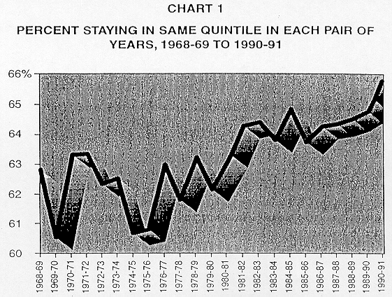
A second basis of comparison is whether the US is more mobile today than in the past. Chart 1 shows the percent staying in the same quintile in each pair of years. It shows that the probability of staying in the same quintile has been increasing. Therefore, by this measure, the US has not become more mobile; if anything, the US has become less mobile.
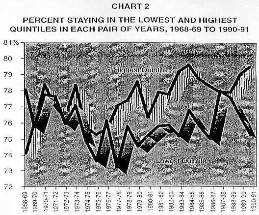
One might, however be more concerned about the bottom and top. Chart 2 shows the percentage of people staying in the lowest quintile and the percentage staying in the highest quintile. If anything, the data in Chart 2 shows that in the 1980s the probability of staying in the bottom was going up. The popular assumption that the United States is becoming a more mobile society is simply not borne out in the data.
With respect to long-term rates, the news is not good either. Table 3 looks at two periods; transitions between 1969 and 1979 and transitions between 1979 and 1989. The probability of remaining in the same quintiles does not change. The bottom line is that there is no evidence of increased mobility.
[page-number of print ed.: 30]
[page-number of print ed.: 31]
[page-number of print ed.: 32]
Table 3 PROPORTION REMAINING IN SAME QUINTILE BETWEEN 1969 AND 1979 AND BETWEEN 1979 AND 1989, ONE- AND THREE-YEAR INCOME MEASURES (%) |
||||||
Initial-Year Quintile |
Annual Income in Each Year |
Three-Year Average Income | ||||
|
(1) 1969-79 |
(2) 1979-89 |
Percentage Point Difference |
(3) 1969-79 |
(4) 1979-89 |
Percentage Point Difference |
|
|
1st Quintile |
55.8 |
55.2 |
-0.6 |
62.6 |
63.2 |
0.6 |
|
2nd Quintile |
26.3 |
33.8 |
7.5 |
34.5 |
36.8 |
2.3 |
|
3rd Quintile |
25.9 |
25.1 |
-0.9 |
28.7 |
30.1 |
1.4 |
|
4th Quintile |
28.4 |
28.9 |
0.5 |
31.3 |
33.9 |
2.6 |
|
5th Quintile |
49.1 |
51.3 |
2.2 |
55.8 |
61.0 |
5.2 |
© Friedrich Ebert Stiftung | technical support | net edition fes-library | Juli 2000