

![[DIGITALE BIBLIOTHEK DER FES]](/images/digbib/d_digbib.gif)

SECTION of DOCUMENT:
[page-number of print ed.: 1]
The Growing Income Gap: What is Happening and Why?
Gary Burtless
This discussion concerns recent developments in American wage and income inequality. It sketches out trends in income and earnings inequality, depicts the influence of growth in earnings inequality on the growth in overall income inequality, and considers what it might mean if technological change is indeed the main source of increased wage inequality, as most economists suspect. The core of this chapter focuses on the following arguments:
( 1 ) Most likely, less than half of the growth in overall income inequality is a direct result of the growth in earnings inequality, contrary to a popular belief – even among economists. Thus, even if international trade, technology, declining unions, or soaring immigration could fully explain the rise in earnings inequality, it would still explain less than half the increase in family income inequality. The fact is, income inequality has grown for several reasons in addition to the jump in wage inequality. Single parent households, with only a single potential earner, are at a high risk of being poor. Women in affluent families continue to join the work force and increase their hours of work, pushing up the distance between affluent, dual-income households and single income households. Unearned income is growing slightly less equal, but more to the point, it is becoming much more correlated with other sources of family income. It should be recognized that increased earnings inequality could be less than half the story.
( 2 ) "Technological change" is an unsatisfying explanation for increased wage inequality, although it is the reason most economists fall back on. This does not imply that it cannot logically account for the jump in pay disparities, or that there is a clear flaw in the evidence leading most economists to think technology is a big part of the explanation, but there is very little direct evidence that technology is a large part of the explanation. In addition, „technological change" is a much broader concept than most non-economists recognize. It
[page-number of print ed.: 2]
encompasses all kinds of changes that extend well beyond machines, computer programming, chemical processes, and assembly line design. For example, it includes ways of organizing businesses and dividing responsibility for production between workers who are employed inside and outside the business. The problem with „technological change" is that it is such a broad concept it is not very helpful in pinning down the sources of increased inequality, or in helping to identify a remedy.
Charts can help to illustrate the main trends more clearly. Let us begin with a description of what has happened to average income and consumption over the past 36 years, from 1959 to 1995. Dividing the last 36 years in half, from 1959 to 1977 (the earlier post-war period) and from 1977 to 1995 (the most recent period) provides an excellent means of comparison. This division demonstrates how the trends in living standards have changed in the recent past (compared with the earlier post-war period).
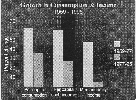
Different statistics give different pictures about how living standards have changed. [Graph 1.1: Growth in Consumption & Income] The two bars on the left show the change in „per capita consumption" – that is, consumption spending per person adjusted for price changes. The lighter bar shows the change between 1959 and 1977 – when consumption jumped 63%; and the dark bar shows the change from 1977 to 1995 – when per capita consumption grew 35%.
Although 35% growth over 18 years is a lot slower than 63%, it is still a big improvement in average consumption. It is the kind of number the Wall Street Journal points to when it tries to play up economic performance in the Reagan and Bush administrations, or when it is
[page-number of print ed.: 3]
Graph 1.1 : Growth in Consumption and Income
[page-number of print ed.: 4]
trying to make the case that the American capitalist economy works well. Still, it should be kept in mind that consumption growth fell off by about half after 1977, compared with the 18 years before 1977.
The middle two bars in graph 1.1 show what’s happened to gross cash income per person (that is, before-tax personal income excluding income from food stamps, Medicare and Medicaid, and employer contributions to health and welfare plans). Gross cash income grew about 60% in the 18 years before 1977 (the middle dark bar) and 27% after 1977 (the middle light bar).
Cash incomes grew more slowly than consumption for two main reasons: (1) Non-cash incomes (which include our employer- and government paid health insurance) grew faster than cash incomes and (2) Americans are saving a smaller percentage of their income, which means consumption has grown faster than income. The important point, however, is that income has grown much more slowly since 1977 than it did before 1977.
The two bars on the right show how fast median family income has grown. It rose about 50% from 1959 to 1977, but just 5% from 1977 to 1995. Median family income is the amount of gross money income received by the family in the exact middle of the income distribution. Half of all families receive more; the other half receive less. The slowdown in median income growth is what pessimists always point to: It has grown just 5% in the past 18 years. „Whoa!" some people say. „How can median family income grow just 5%, when per capita income has jumped 27%? That makes no sense!"
But it does make sense. Median family income has increased more slowly than average income per person for two main reasons: the median family has about 7% fewer members today than it did in the mid-1970s. So, even if median income was completely unchanged,
[page-number of print ed.: 5]
the amount of income per person in the median family would have climbed 7%. Look at it like this: Mom and Dad keep putting out the same size pie every night, but in 1977 the pie had to feed 3.6 family members, whereas in 1995 it only had to feed 3.4 people – Mom, Dad, and their one-and-four-tenths children.
That explains 7% of the difference. Which means income per person in the median family increased 12% (5% plus 7%) over the past 18 years. Meanwhile, income per person in the whole country grew 27%. Where did the other 15% of income growth go? Basically, it went to people high up in the income distribution.
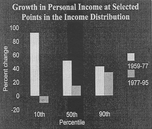
The next chart indicates how fast incomes have been climbing in different parts of the income distribution. [Graph 1.2: Growth in Personal Income at Selected Points] Once again, the lighter bars show how fast income grew between 1959-1977; the darker bars show how fast it increased between 1977-1995. On the left, I show how much personal income grew at the 10th percentile; in the middle, I show how fast it grew for the median person; and on the right, I show how fast it grew for someone at the 90th percentile.
Look first at income at the 50th percentile – at the median point in the income distribution. It rose about 50% between 1959-1977, but it grew a bit less than 15% between 1977-1995. Poor people fared better than the middle class from 1959 to 1977 (the income at the 10th
[page-number of print ed.: 6]
Graph 1.2: Growth in Personal Income at Selected Points
[page-number of print ed.: 7]
percentile jumped 90%), but they have fared a lot worse since 1977 (income at the 10th percentile has shrunk 10%). Rich people fared worse than the middle class before 1977 (when income at the 90th percentile rose 43%); but they’ve done much better than middle income people in the 18 years since 1977 (when income at the 90th percentile rose 34%).
Every income position in the graph shows slower income growth since 1977: the dark bars are always lower than the light bars right next to them. But the slowdown was much greater for people at the bottom (who saw their incomes fall after 1977) than it was for people in the exact middle. And the slowdown was much smaller for people near the top than it was for people in the middle or at the bottom. In fact, if you go far enough up the distribution – say, above the 95th percentile – there has been no slowdown in income growth at all. Incomes up there have actually been growing as fast or faster than they grew before 1977.
Clearly, income inequality fell between 1959 and 1977 but then increased after 1977. The increase in inequality is a big reason that „typical" Americans have seen less income improvement than suggested by the growth in „average" consumption or personal income. Still, these statistics show an improvement in the incomes of „typical" people over the past 18 years, contrary to the popular perception. Keep in mind, too, the increase in the middle would look bigger if all those non-cash income sources were added. The improvement has simply been much slower than it was in the preceding 18 years. Notice that for people at the bottom, adjusted incomes have shrunk since 1977.
By age groups. The slowdown in real income growth has affected different age groups in different ways. Families headed by younger people have suffered bigger declines in income growth than families headed by middle-age or older people.
[page-number of print ed.: 8]
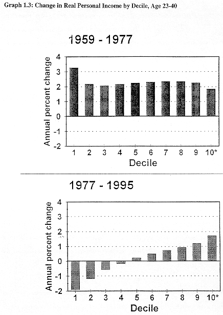
Now a look at how income changed in each decile of the income distribution among people in younger families. [Graph 1.3: Change in Real Income by Decile, Age 23-40] Here all the people who are members of families headed by an adult between 23 and 40 years old are included. The bars at the top show adjusted income gains in 1959-1977, the bars at the bottom show gains between 1977 and 1995. Each bar shows the annual percentage rate of change in income. The lowest income decile is on the left, the highest is on the right.
A couple of things are noticeable: first, the bottom bars (with one exception) are a whole lot taller than the top ones, indicating that income growth fell off steeply after 1977. Second, inequality fell sharply between 1959 and 1977, and it increased between 1977 and 1995. In the bottom decile (the bottom tenth of the population), personal income rose faster than 3% a year before 1977, but then fell almost 2% a year after 1977. In the top decile, income climbed 1.9% a year before 1977 and 1.8% a year after 1977. Up at the top, there has been virtually no slowdown in income growth.
The significance of income falling 2% a year, as it did among the bottom tenth of families headed by a young person, should be mentioned. It means that annual income fell from $3,150 per person (where it was in 1977) to just $2,240. That is a cash monthly income of about $187 per person in the family. Notice that incomes in the bottom 4 deciles – that is, the bottom 4 tenths of the population – have fallen since 1977.
In the exact middle of the distribution, income edged up 0.2% or 0.3% a year after 1977. Not very good, but not a drop in income either. Remember this information relates only to people in young families, not to people in all families. Families headed by older adults did better than young families. But the pattern of very slow income growth in the middle and at
[page-number of print ed.: 9]
[page-number of print ed.: 10]
the bottom and faster growth at the top was the same among the old as it was among the young.
To summmarize: Contrary to popular belief, incomes and consumption increased among middle-class families over the past twenty years. They just grew a whole lot slower than they did in the previous twenty years. The low-income population has seen a drop in its standard of living standards, and the drop was especially pronounced among families headed by the young.
The overall economy has done much better than suggested by the progress of middle-class or lower-class families, because 80 - 90% of overall income growth has been enjoyed by the 10 - 15% of families with the highest incomes.
Causes. A number of changes in the economy, in public policy, and in family and household composition contributed to recent trends in income growth and inequality. Overall income growth slowed for one main reason: Annual labor productivity increases have fallen about two-thirds since the early 1970s.
Inequality increased after the mid-1970s for four main reasons:
- There was a big decline in the percentage of Americans who live in a family where a male breadwinner is present. There are more one-parent families. This trend sharply increased the percentage of families with low expected incomes.
- Male heads of family saw a big jump in wage disparities: High paid men got pay increases; low paid men saw their wages fall.
[page-number of print ed.: 11]
- There is growing correlation between wives’ earnings and other sources of family income, particularly the husbands’ earnings. This powerful trend increases the income gap between affluent, dual-income families and other kinds of households.
- Finally, the 1980s saw a big increase in types of unearned income, like interest and dividends and private retirement benefits that are strongly correlated with a family’s position in the overall income distribution. Let’s face it, if interest payments and corporate stock options go up faster than other kinds of income, single mothers and 8-dollar-an-hour factory workers do not benefit much.
Earnings trends. Slow earnings growth and the jump in wage inequality are the main factors behind people’s perception of stagnant or declining living standards.
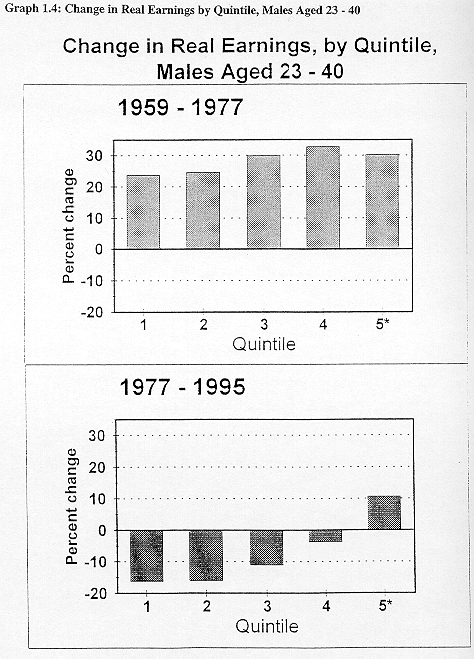
Young men suffered the most. [Graph 1.4: Change in Real Earnings by Quintile, 23-40 Year-Old Males] How much have earnings changed in the periods previously discussed? I calculated the annual earnings of men who work all year round on a full time schedule. The men are ranked from lowest to highest by their earnings and divided into 5 equal-size groups. Bars on the left show how much earnings in the lowest quintile have changed (in percent); bars at the right refer to men in the highest wage quintile. This chart refers to earnings patterns among men between the ages of 23 and 40 – that is, young men.
In the eighteen years before 1977, earnings adjusted for inflation jumped around 25% - 33% (bars at the top of the chart). Notice that earnings gains were nearly as fast among low-wage as among high-wage men.
The experience after 1977 has been a whole lot worse (bars in the lower part of the chart). Wages fell in the bottom 80 percent of the young men’s earnings distribution, with the
[page-number of print ed.: 12]
[page-number of print ed.: 13]
steepest drop in the lowest part of the distribution. Earnings in the bottom 2 quintiles of the distribution fell about 18% between 1977 and 1995. Among men in the middle quintile, earnings dropped 10%.
Young men receiving average or below-average pay might plausibly believe that US living standards are in decline. In comparison with the real earnings received by male workers at the same stage in their careers, most young men earned significantly less in 1995 than they would have earned in 1977.
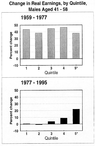
Older men did better, but they also experienced a major fall-off in earnings improvement after 1977. [Graph 1.5: Change in Real Earnings by Decile, 41-58 Year-Olds] Between 1959 and 1977 men aged 41-58 enjoyed earnings gains of about 40%, and the pattern of earnings growth was pretty egalitarian. The rate of growth fell off after 1977, especially for 41-58 year-old men in the lower ranks of the earnings distribution. In fact, in the bottom two quintiles, real earnings edged down or remained unchanged after 1977. Only at the very top of the earnings distribution did earnings continue to grow fast after 1977. Though average-wage men between the ages of 41 and 58 have not suffered an actual decline in their earnings over the past 18 years, they have not seen much improvement either.
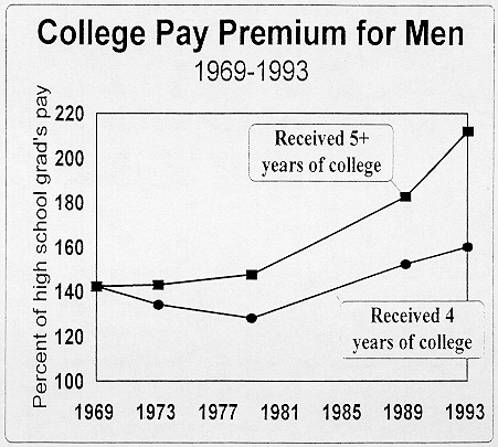
A big reason that pay disparities have increased so much is that employers are paying a much bigger premium for worker skills. Probably it would be more accurate to say „They’re imposing a bigger penalty on the unskilled." The easiest way to see what has happened to the skill premium is to compare the median wage earned by workers with a college education and those with just a high school education. [Graph 1.6: College Pay Premium for Men] In 1969, men with either 4 years of college or 5+ years of college earned 140% of the median high school graduate.
[page-number of print ed.: 14]
Graph 1.5
[page-number of print ed.: 15]
Graph 1.6
[page-number of print ed.: 16]
In other words, they earned 40% more. By 1993, men with 4 years of college earned 60% more than the median high school grad; and men with 5 or more years of college earned 115% more than the high school graduate. A lot of this is because the earnings of high school graduates have fallen. But for those men with 5+ years of college, a lot of it is because their pay has gone up considerably.
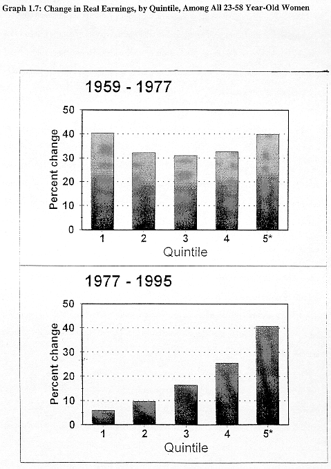
Earnings improvement among women was a lot better than among men after 1977, [Graph 1.7: Change in Real Earnings among All 23-58 Year-Old Women] but you’ll notice a similar pattern of growing wage disparity. The same factors pushing up wage inequality among men were also operating here. Fortunately for women, the increase in inequality has not resulted in big declines in real earnings for any major group of workers. Highly paid, highly educated, and highly skilled women have enjoyed much bigger pay increases than low-paid, poorly educated, and less skilled women.
The progress of American women is certainly a bright spot in the labor market. Their progress is partly based, however, on a big increase in the amount of time they spend working for pay. Some working-age Americans may doubt whether the resulting increases in family income have been large enough to offset the sacrifices required to put an extra family member in a job.
For younger working-age families, the earnings gains achieved when women take jobs often do not match the earnings losses they have sustained because male wages have declined. A 20% increase in a wife’s earnings may be too little to offset the impact of a 10% drop in what the husband earns. Even in the middle of the income distribution, the modest gains in income may be regarded as too small to offset the added cost and stress of sending off two family heads rather than only one to paid work.
[page-number of print ed.: 17]
[page-number of print ed.: 18]
For older Americans the story is a bit different. They have managed to enjoy gains in personal income at the same time their principal breadwinners have withdrawn from the work force at an earlier age. If there has been stagnation or decline in American living standards, its effects have been felt mainly by average-income and below-average-income families with a working-age head.
II. Why has earnings inequality gone up?
The trends in pay inequality certainly look as though they must have contributed to the trend in overall income inequality. Both saw an upward trend in the 1970s, and the trends accelerated after 1979.
My calculations in other research papers suggest that less than half the rise in overall income inequality is due to the rise in earnings inequality. A number of other developments lie behind the widening income gap. Gains in capital income, employer-sponsored pensions, and Social Security in the 1980s caused unearned income to grow rapidly. The people at the top end of the income distribution received most of the gains in capital income and much of the increase in employer-sponsored pensions.
At the same time, a changing pattern of government transfers reduced the effectiveness of government payments in combating poverty. Payments targeted on working-age families with low incomes were scaled back; public pension payments, which go to working-age families regardless of their incomes, became more important.
The changes in the structure of US households should also be mentioned. A growing percentage of Americans live in single-parent families, which adds to income inequality.
[page-number of print ed.: 19]
Single-parent families are much more likely to be poor than families with two parents, and a bigger percentage of Americans are now members of single-parent families.
Finally, the increases in market employment among American women have tended to boost inequality since the late 1970s. In the 1950s and 1960s, families with a highly paid male earner were less likely than average to have a well-paid female earner. By 1993, families with a highly paid male earner were more likely than average to have a highly paid female earner. The growing correlation of husbands’ and wives’ earned incomes tends to increase the income gap between dual-earner husband-wife families and other types of families.
Since women’s earnings are a growing percentage of adjusted personal income, the change in this correlation is becoming increasingly important over time. Women’s earnings and non-labor income have grown significantly since 1969, reducing the share of income from male head earnings.
III. Even though technological change is most economists’ favorite explanation for the growth in wage disparities, it is not a very satisfying explanation for two reasons.
First, the direct evidence in support of it is notoriously weak. Economists do not conclude that technological change has caused recent inequality trends because they directly observe the skill requirements embodied in specific technological advances. In fact, they have little evidence about the skill requirements embodied in any production process. What they observe instead is the skill distributions of workers employed in different plants or industries and the absolute levels of pay received by workers in different skill classes. The changing pattern of use of workers in different skill classes and the changing pattern of their pay is easy to „explain" by saying that the production technology has changed in a way that makes production more intensive in its requirement for skill. But this statement simply means that
[page-number of print ed.: 20]
other explanations of changing pay patterns (such as growing international trade or weaker labor unions) cannot satisfactorily account for a big percentage of the trend in the relative wage structure or the relative intensity of use of workers at different skill levels. The explanation is analogous to „explaining" the slowdown in productivity growth after 1973 by saying that there has been a slowdown in technological advance. In both cases the explanation would be more useful and convincing if we could point to specific evidence about technological change that would tend to support it.
Second, „technological change" does not have the narrow interpretation that most non-economists might assume. „Technology" is a very broad economic concept. One standard textbook defines it as the „state of knowledge about the various methods that might be used to transform inputs into outputs."
[ Robert S. Pindyck and Daniel L. Rubinfeld, Microeconomics (Second Edition), New York: Macmillan, 1989, p. 167.]
The personal computer is an example of a technological advance with which many economists and non-economists are familiar. The dramatic decline in the cost of stand-alone computers has influenced the way goods and services are produced in a wide variety of industries and occupations. Arguably, this change has put a premium on the ability of workers to acquire the skills needed to operate computers. Workers who possess this ability might be favored; workers who lack it may suffer.
But this is only one of a wide class of changes in the workplace that fits the economist’s definition of „technological change." The introduction of the assembly line in automobile production during the early twentieth century also represented technological change. The assembly line technique was not driven mainly by the development of a new piece of machinery, but by a different and more efficient conception of how workers and materials could be organized to produce a car.
[page-number of print ed.: 21]
Sometimes no piece of machinery or scientific advance is involved in a technological change. As recently as the early 1970s many observers believed that senior corporate managers could not be replaced by stockholders, who were too numerous and poorly organized to exert a decisive influence on company management. As a consequence, lax, foolish, or unprofitable company management could survive for as long as managers could keep their companies out of bankruptcy. By the middle of the 1980s it was plain that this view was seriously incomplete. Innovations such as leveraged buyouts made it possible for a small number of well-organized stockholders and lenders to take over a company’s management and fundamentally change the direction of a corporation: for example, by modifying historical pay patterns in the company, selling off unprofitable operations, and outsourcing the production of important company inputs. This innovation, too, may have caused big increases in pay disparities, both within and between companies, but it is not the kind of innovation most people have in mind when they are told that „technological change" is the most important single source of rising wage inequality.
It is important for non-economists (as well as economists) to understand the wide variety of changes included under the broad umbrella of „technological change." This explanation for wider pay disparities is so broad that it is not very helpful in offering solutions to the social and economic problems arising out of greater inequality. In this one important sense, then, technological change may not be much of an explanation at all.
Over the past 25 years, the country has seen a dramatic shift in the pattern of demand for workers with different levels of skill. Job opportunities for the less skilled have declined, and relative wages for unskilled and semi-skilled workers have plunged. These trends aren’t confined to any one set of industries, such as manufacturing or the traded-goods sector, however. They are pretty obvious in all industries, including government, construction and retail trade, where international trade is a trivial consideration.
[page-number of print ed.: 22]
Our leading explanation for increased wage inequality is „biased" technical trade. Changes in the technology of production, such as the invention of the personal computer or the introduction of new forms of business organization, have favored workers with greater skill and reduced the value of unskilled labor. Economic deregulation, new patterns of immigration into the United States, declining minimum wages, and the dwindling influence of labor unions have also contributed to the job problems of unskilled and semi-skilled workers. Liberal trade with the newly industrializing countries has certainly hurt the unskilled to some degree.
In sum: American incomes and living standards have improved over the past two decades. But the improvement has been slow, uneven, and, for many, disappointing. Incomes are now growing weakly and are much more unequal. Real incomes have continued to improve among all age groups, but the deceleration of income growth has been quite pronounced among families with a young breadwinner. In fact, incomes are actually declining among poor and lower middle class families with breadwinners who are less than 40 years old.
One group has conspicuously succeeded in maintaining and even improving its rate of income growth in the past two decades: Families in the top 5 percent of the income distribution have suffered no deceleration in income growth. Not only have these families enjoyed faster income gains than families in lower parts of the income distribution, they have actually enjoyed an acceleration in income growth in comparison with the period before 1977.
It should be re-emphasized that families in the middle class continue to enjoy growing incomes. Contrary to a popular view, even families in the middle of the distribution have seen their incomes grow. The rate of income growth is simply much slower than it was up through the mid-1970s. Young families and many workers at the bottom of the income distribution
[page-number of print ed.: 23]
have suffered an erosion in their relative economic position. A few have suffered a loss in their absolute position.
New census statistics offer some hint that the long-term trend toward greater inequality has paused, at least in the past half decade. But unless the trend is reversed, many Americans will persist in their belief that living standards are stagnant or declining – no matter what the official statistics tell them.
© Friedrich Ebert Stiftung | technical support | net edition fes-library | Juli 2000